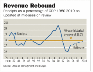
"thank heaven for the tax cuts that have helped to spur the economy that is now throwing off higher tax revenues. As the chart shows, those revenues are now rising back to their modern average as a share of GDP, just as supporters of the tax cuts predicted."Here is the wonderful chart—which exemplifies the meaning of the phrase "a picture is better than a thousand words"—that they refer to:
 Now, as far as my eye can see, revenue receipts per this chart have been over the 40-year historical average of 18.2% in only two sustained periods: 1980-82 and 1994-2001. As readers will recall, the Reagan tax cuts first went into effect in 1981 and then again in 1986. This graph clearly shows that revenue receipts, except for minor blips in 1987 and 1989, were below the 40-year historical average not only through the "seven fat years (1983-1989)" of the Reagan presidency, but also through the three lean years (1990-92) of Bush 41. Revenue receipts then began their climb over the 40-year historical average in the "seven fat years (1994-2001)" of the Clinton presidency. After the "trifecta" of 2001—recession, Bush 43’s first tax cuts, and 9/11—hit the U.S. economy, revenue receipts plunged sharply below the 40-year historical average through the remaining three years (2002-2004) of the Bush 43 first term!
These facts are there for the naked eye to see—we have been bitten twice by the supply side bug in the past 25 years, without sustained revenue rebounds. For readers that might be interested, I have presented more empirical data on this subject in my new book, "The Bush Diaries", which is being published by iUniverse next month. Notwithstanding this year’s upward surge in revenues and OMB’s optimistic estimate through 2010, I would wait at least another couple of years before celebrating any "Windfall for Washington".
No comments:
Post a Comment